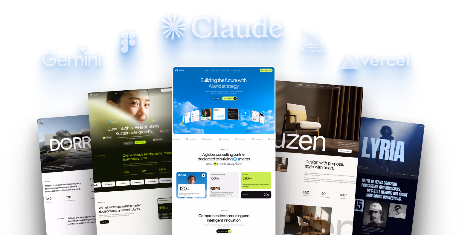
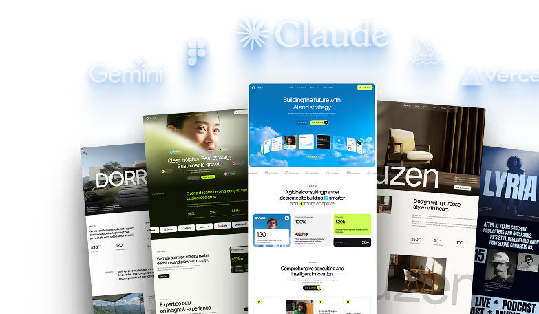
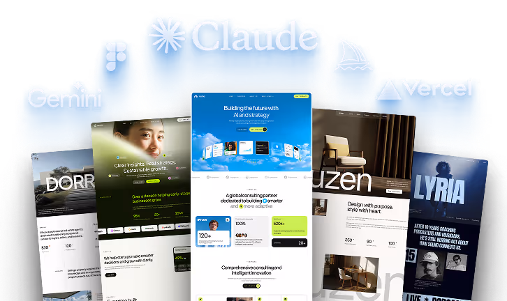
How to Use Framer Templates

Framer templates let you build professional websites without coding or high costs. Here’s why they’re a great choice:
- Save Time and Money: Templates cost less than hiring developers ($25–$49/hour) and reduce development time.
- Responsive Design: Built-in responsiveness ensures your site looks great on phones, tablets, and desktops.
- Ease of Use: Customize colors, fonts, layouts, and animations with a user-friendly drag-and-drop editor.
- Variety of Options: Over 1,000 templates available - free and paid - for industries like SaaS, e-commerce, and portfolios.
- SEO-Friendly: Many templates optimize for search engines, helping you rank higher from the start.
- Scalability: Add pages and features as your business grows.
Quick Steps to Get Started:
- Choose the Right Template: Pick one tailored to your industry (e.g., e-commerce, SaaS, creative portfolios).
- Customize for Your Brand: Add your logo, brand colors, and fonts. Adjust layouts and images to match your style.
- Ensure Mobile Optimization: Use Framer’s responsive tools to adapt your site for all screen sizes.
- Add Animations: Use subtle effects like hover animations or scroll-linked reveals to enhance user experience.
- Test and Launch: Check performance, responsiveness, and SEO before publishing.
Framer templates simplify website building, letting you focus on growing your business while maintaining a polished online presence.
Framer Basics For Customizing Templates

How to Choose the Right Template for Your Project
Picking the right Framer template is all about finding a foundation that fits your business goals. To make the best choice, you need to clearly understand your needs before exploring the available options.
"Choosing the right website template is a crucial step in building a successful online presence."
Start by identifying your business objectives - whether you're running an e-commerce store, a SaaS platform, or showcasing a portfolio. Your template plays a huge role in shaping first impressions, and with 94% of initial judgments tied to web design, this decision directly impacts how visitors perceive your site. Once you've got the right template, you'll be ready to dive into the customization process, which we'll cover later.
Finding Templates for Your Industry
Using industry-specific templates can save you a ton of time and effort. When a template is tailored to your business niche, it’s more likely to meet your needs without requiring extensive changes. Instead of forcing a generic layout to work, choose a design built with your industry in mind.
For SaaS companies, look for templates with clean layouts that highlight product features, pricing tables, and customer testimonials. If you're in e-commerce, prioritize templates with product galleries, shopping cart functionality, and a seamless checkout process. This is particularly important as mobile commerce is projected to account for 62% of all online sales by 2027. A great example is LARQ, which increased its year-over-year revenue by 400% by focusing on a streamlined checkout experience.
Wellness and fitness brands should consider templates that emphasize visual storytelling with features like client transformation galleries, class schedules, or booking systems. Creative professionals and portfolio sites, on the other hand, need designs that showcase visual work front and center, with minimal distractions and fast-loading image galleries. Templates that include content collections tailored to your posting habits can also make a big difference.
By choosing an industry-specific template, you simplify the branding and customization process. Once you've narrowed it down, evaluate the features to ensure the template offers everything your business needs.
Template Features to Look For
Your template must be responsive - mobile traffic now dominates the web, and 8 out of 10 visitors will leave a site that doesn’t display well on their device.
Look for templates with built-in SEO tools, clean code, and fast-loading pages to help improve search rankings. Subtle animations can enhance the user experience, but avoid overdoing it; opt for designs with tasteful, functional animations.
If you’re selling online, e-commerce integration is a must. Choose templates that support product catalogs, secure payment options, and inventory management. With over 70% of online retailers expecting AI-driven personalization to shape their business in 2024, consider templates that allow for tailored user experiences.
For content-heavy sites, CMS integration is crucial. It makes updating blogs or product details easy, even if you’re not a tech expert. A good template strikes a balance between pre-built components and customizable options.
Support and documentation are also key. Templates that come with video tutorials, detailed guides, and responsive customer service make customization and upkeep far easier. As of 2025, some providers even include step-by-step video walkthroughs with their templates.
Finally, think about scalability. Your template should grow with your business, letting you add pages, features, and functionality as needed. Testing the template on various devices and screen sizes ensures a smooth experience for all users. A well-chosen template saves time, money, and headaches - and specialized designs often perform better and faster than generic ones.
How to Customize Framer Templates for Your Brand
Once you've chosen a Framer template, the next step is to tailor it to your brand. This involves updating your brand assets, tweaking layouts, and adding interactive elements to create a seamless and engaging experience. Here's how to do it step by step.
Adding Your Brand Assets
Start by incorporating your brand's visual identity - colors, fonts, and images. Framer templates often include design systems with global styles, making it easy to update your site's look with just a few adjustments.
Head to the Assets tab to update global colors. By changing the color swatches here, you can apply your brand's palette across the entire site automatically, saving time and ensuring consistency. In the same section, you'll find the Typography settings. Stick to two or three font styles to maintain a clean and cohesive design. This not only simplifies the visual hierarchy but also keeps the site looking polished.
For images and logos, there are two ways to make updates. Standard images can be replaced by simply clicking on them and uploading your files via the right-hand panel. For component-based images, click on the component first, then locate the image option in the same panel. To avoid disrupting the layout, use replacement images that match the original dimensions.
You can also edit text directly on the canvas by double-clicking any text element. This allows you to see changes in real time. If your brand doesn't yet have a fully developed visual identity, take some time to establish brand guidelines. A defined color palette, font selection, and image style will make the customization process smoother and more effective.
Editing Layouts and Visual Structure
Framer's drag-and-drop editor makes it easy to adjust layouts to suit your business goals while maintaining a professional design.
Start by updating theme colors in the Styles section to align with your brand. For instance, a tech company might choose a sleek blue-and-white palette with modern fonts like Inter, while a boutique brand might lean toward soft pastels and serif fonts for a more elegant feel.
Typography updates go beyond simply picking fonts. You can upload custom fonts or choose from Framer's library, ensuring font sizes, styles, and spacing remain consistent across all pages. Use Framer's grid and spacing tools to keep your layout neat and well-organized.
Next, rearrange sections to guide visitors toward your key messages or calls to action. For example, a small business might add a featured products section, while a freelancer could highlight a bold headline like "Helping brands build stunning digital experiences." Replace placeholder images and logos with high-quality visuals that represent your brand, and make sure they're optimized for both performance and appearance.
Before finalizing changes, test them on a staging site to ensure everything looks great across devices. Setting maximum widths for content containers prevents layouts from stretching awkwardly on large screens, while using relative units like em or rem for text ensures proper scaling on smaller devices.
Adding and Setting Up Animations
Animations can make your site more engaging, and Framer offers motion components designed for smooth, high-performance effects.
Use the animate property to define transitions for elements. You can specify the duration and easing to create smooth effects like hover feedback or fade-ins during scrolling. These subtle touches enhance the user experience without being overwhelming.
For a more dynamic feel, try scroll-linked animations that reveal content as users navigate the page. Keyframe animations allow for more complex sequences, while gesture animations (like hover, tap, or drag effects) are perfect for interactive elements such as buttons or cards. If you decide to use looping animations for continuous motion, keep them minimal to avoid distracting users.
Make sure every animation serves a purpose - whether it's drawing attention to a key feature or improving usability. And don't forget about accessibility: always provide options to reduce or disable motion for users who may be sensitive to animations. Thoughtful implementation ensures your site feels polished and inclusive.
sbb-itb-fdf3c56
Making Your Template Work on All Devices
As of 2023, nearly 60% of web traffic comes from mobile devices, making it essential to ensure your Framer template performs well across all screen sizes. Framer's responsive design tools make adapting layouts to different devices straightforward.
Setting Up Breakpoints
Breakpoints are the backbone of responsive design in Framer. These are predefined width thresholds that trigger layout changes, allowing your design to adjust seamlessly to various screen sizes.
Framer uses a desktop-first approach, with the primary breakpoint set at 1,200px. This means you start by designing for desktop screens and then scale down for smaller devices [8]. This method is particularly useful for intricate layouts and web applications where desktop functionality takes precedence.
Here’s how Framer's breakpoints are structured:
- Desktop Large: 1,920px
- Desktop Medium: 1,440px
- Tablet Large: 1,024px
- Tablet Medium: 840px
- Mobile: 390px
Framer’s system ensures that changes made at larger breakpoints automatically carry over to smaller screens unless you override them. Begin your design process at the 1,200px desktop breakpoint. Use percentage-based widths, enable auto-sizing, and organize elements in stacks to keep layouts consistent across breakpoints.
For mobile optimization, make targeted adjustments:
- Replace complex menus with a burger or dropdown menu.
- Simplify the hero section by using smaller images, centering text, or removing visuals completely. Ensure call-to-action (CTA) buttons are large enough for easy tapping.
- Stack footer elements vertically and convert multi-column layouts into single columns for better readability on smaller screens.
Stacks are a game-changer for maintaining clean, responsive layouts. They handle spacing and alignment across breakpoints automatically, saving you the hassle of manual adjustments. Grouping elements in stacks ensures your design stays organized, even when screen sizes vary significantly.
Fine-tune your design by adjusting padding and margins to keep all elements within the viewport. Use em or rem units for text to ensure proper scaling, and set maximum widths for content containers to avoid awkward stretching on large screens.
Once your breakpoints are in place, rigorous testing across devices is key to ensuring a consistent experience.
Testing on Different Devices
Defining breakpoints is just the first step - testing ensures your design functions as intended across all devices and browsers. With 83% of mobile users expecting a smooth experience, thorough testing is non-negotiable.
Start with Framer's Preview Mode to quickly check how your design looks at different breakpoints. For deeper testing, use Chrome DevTools to simulate various screen sizes and orientations. Tools like Responsinator or BrowserStack can provide a comprehensive view of your design across multiple devices simultaneously.
Testing on actual devices is crucial for accurate feedback. Check your design on smartphones, tablets, and desktops of varying sizes. Pay close attention to touch interactions - buttons that work well with a mouse might be too small or poorly positioned for finger taps.
Key areas to focus on during testing include:
- Text readability across all screen sizes.
- Navigation menu functionality on mobile devices.
- Proper scaling of images and videos.
- Consistency of branding elements across breakpoints.
- Loading speed, especially on slower connections.
Keep in mind that 53% of mobile users abandon sites that take more than three seconds to load.
Create a testing checklist to cover all responsive design needs before launching. This should include:
- Verifying that text width stays between 75–90 characters per line for readability.
- Ensuring buttons are appropriately sized and spaced for mobile users.
- Checking that image galleries display one image at a time with swipe navigation on mobile.
- Testing forms by converting them to single-column layouts for mobile and ensuring touch targets are easy to tap.
- Confirming that tables collapse properly or switch to stacked card layouts on smaller screens.
Lastly, review every interactive element and visual component systematically for each breakpoint. This detailed approach ensures your Framer template delivers a smooth, user-friendly experience, no matter how visitors access your site.
Publishing and Maintaining Your Website
Once your site looks great on every device, it’s time to launch and keep it running smoothly. Launching is just the beginning - ongoing maintenance is key to ensuring your website stays secure, fast, and engaging.
Getting Ready to Launch
Before launching, take the time to test everything thoroughly. Use tools like Google PageSpeed Insights to spot performance issues that might slow your site down. Check that all forms, menus, and interactive features work seamlessly across different browsers.
SEO is another crucial step. Make sure each page has unique meta titles and descriptions, your favicon is correctly displayed, and heading tags follow a logical hierarchy. A real-world example? Formula Bot jumped from 6th to 2nd place in Google rankings by optimizing their technical SEO before going live.
Framer makes hosting straightforward with built-in options. You can launch quickly using Framer Hosting or connect your custom domain for a polished, professional look. Keep in mind, DNS propagation can take 24–48 hours, so plan accordingly.
Create a pre-launch checklist to ensure everything is in place - double-check contact forms, links, images, and text for consistency.
Don’t forget about security. Enable SSL encryption to protect user data and improve search rankings. Framer and many hosting providers automatically include SSL certificates for custom domains, making this step hassle-free.
Set up analytics tools like Google Analytics or Framer’s built-in analytics before launch. These tools start gathering visitor data from day one, giving you valuable insights into user behavior and helping you measure improvements over time.
With these steps completed, you’re ready to launch. Once your site is live, shift your focus to keeping it updated and performing at its best.
Improving Your Site After Launch
Launching your site is just the start - regular maintenance ensures it stays secure, fast, and user-friendly. Analytics tools provide a window into how visitors interact with your site, showing areas where you can improve. Keep an eye on metrics like bounce rate, session duration, and conversion rates to measure your site’s success. A/B testing can also help refine your design by comparing how users respond to different layouts, colors, or content arrangements.
Performance optimization should be an ongoing effort. While Framer automatically handles image optimization and font loading, you can further improve speed by reducing large blurs and shadows that might affect scrolling performance. For video content, stick to platforms like YouTube or Vimeo to ensure smooth delivery without bogging down your site.
Fresh content keeps visitors engaged and boosts search rankings. Update blog posts, refresh product details, and add new testimonials or case studies regularly.
"Learning to update and maintain your website ensures that it is fully functional, relevant, accurate, secure, and visually appealing, something that will draw your customers in rather than keep them out."
- Ventsislav Kirilov, Author, NEXT BASKET
Security is another top priority. Use strong passwords, enable multi-factor authentication, and keep plugins or integrations up to date. Automated backups are your safety net - store them in multiple locations and test them periodically to ensure they work.
To keep your site running smoothly, monitor performance and use tools like Google PageSpeed Insights to check loading speeds. Pay attention to third-party scripts that might slow down your site and use async or defer attributes to control their loading order. Framer’s built-in optimization tools can help you stay on top of these tasks.
Make it a habit to review your site monthly. Assess performance, update content, and address any technical issues before they grow into bigger problems. By staying proactive, you can ensure your Framer template continues to deliver a great user experience long after launch.
Conclusion: Making the Most of Framer Templates
Framer templates provide a smart way to create professional websites without the hefty price tag, extended timelines, or need for complex coding. This guide has walked you through practical steps to tackle common web development challenges - like picking the right template for your niche, customizing it to match your brand, and ensuring it works seamlessly across devices - so you can launch a website that genuinely reflects your business.
One of the biggest perks of Framer templates is their cost-effectiveness. Harish Malhi, Founder of Goodspeed, puts it perfectly:
"Framer templates remove the biggest barriers non-tech founders face - high costs, long timelines, and complex coding. With a ready-to-use, scalable, and professional website, you can launch faster, customise with ease, and grow without limitations."
These templates are not just budget-friendly; they’re also incredibly flexible and adaptable. For example, as a SaaS founder, you can test different call-to-action buttons or tweak your landing page based on user feedback - all without writing a single line of code. Changes can be made in less than an hour, giving you the freedom to experiment and refine your site as your business evolves. Plus, responsive design ensures your site looks polished on any device, while drag-and-drop tools make it easy to maintain a consistent brand identity without extra design expenses. From mobile to desktop, everything is optimized right out of the box.
Launching your website is only the first step. To stay competitive, focus on regular updates, monitor performance, and keep your content fresh. By following these practices, you’ll create a site that not only stands out but also grows alongside your business.
FAQs
How can I choose the right Framer template for my industry and business goals?
To pick the best Framer template, start by determining the primary goal of your website. Is it to display a portfolio, sell products, or boost brand recognition? For instance, SaaS companies often thrive with templates that highlight features and customer testimonials, while e-commerce businesses should prioritize templates tailored for showcasing products and offering an easy checkout process.
Make sure the template includes customization features like adjustable layouts, colors, and fonts to match your brand’s style. Also, prioritize templates that are responsive, ensuring they look great and function smoothly on all devices. Keeping these points in mind will help you choose a template that aligns perfectly with your business goals and industry needs.
How can I make sure my Framer template works perfectly on mobile devices?
To make your Framer template work seamlessly on mobile devices, here’s what you need to do:
- Add responsive breakpoints: Tailor your layout for various screen sizes so your design looks sharp on any device.
- Use flexible dimensions: Opt for percentages or relative units instead of fixed pixels to keep your layout fluid.
- Optimize your images: Go for lightweight formats like WebP and enable lazy loading to boost loading times.
- Test thoroughly: Use real devices and simulators to ensure usability and compatibility across different screen sizes.
- Keep animations simple: Streamline animations and interactions to maintain smooth performance on mobile.
And don’t forget, Framer’s built-in mobile preview is a handy tool to see how your design adapts in real-time!
How do I update and manage my website after launching it with a Framer template?
After getting your website up and running with a Framer template, keeping it fresh and updated is a breeze. The Framer editor features an easy-to-use drag-and-drop interface, making tasks like updating text, swapping out images, adjusting layouts, or adding new sections simple - even if you’re not a tech expert.
To stay on top of your updates, the Framer dashboard lets you track all the changes made since your last publish. Once everything looks good, just hit Publish to bring your updates live. Regularly reviewing and tweaking your content ensures your site remains relevant and aligned with your goals.
Related posts
Recommended posts