How Visual Hierarchy Impacts Website Templates

Visual order helps make websites easy to use and nice to look at. It leads people's eyes to key parts of a page, showing them where to go next. A good visual order makes the site better, wins trust, and gets more clicks. Here's how it does it:
- Size Matters: Big things (like titles or buttons) catch the eye first.
- Colors and Contrast: Bold colors help important things pop out and are easier to read.
- Typography: Simple fonts and sizes sort content and make it easier to read.
- White Space: Space around stuff makes it stand out and keeps it from looking too busy.
- Responsive Design: Changes the layout for all device sizes, making sure it looks good on both big screens and small phones.
- CTA Placement: Where you put buttons (top, middle, or bottom) can really up clicks and sales.
For instance, a change in button color or size can make sales go up by as much as 21%, and having CTAs in the middle of the screen can make clicks soar by 682%. By keeping things clear, simple, and easy, sites work better at turning folks who stop by into buyers.
WHY HIERARCHY IS SO IMPORTANT IN WEB DESIGN: Free Web Design Course | Episode 8
Key Parts of Showing Order in Website Design
Showing order is the main part of good website designs. It helps to lead the eyes of users and makes moving through the site simple. By knowing some main details, you can make designs that not only look neat but also keep users interested and get good results. These rules put together content and point focus to the top parts of your work.
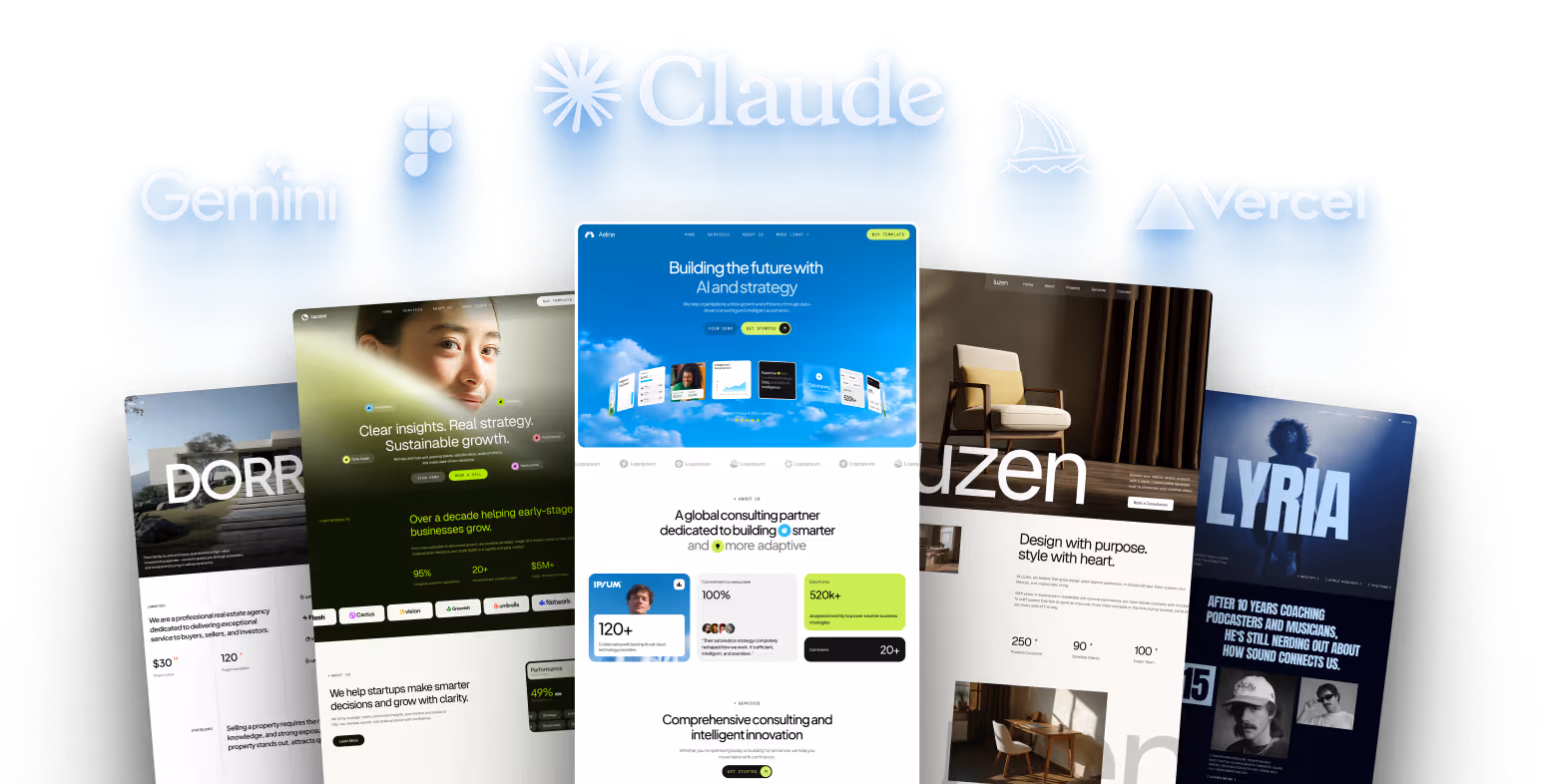
Temlis templates mix these basics well, giving out looks that catch the eye and are easy to use. Let's go over the key parts that make templates that respond well and push for action.
Size and Balance: Moving the Eyes
Size is a big tool in grabbing attention. Big things pull the eyes first, showing they are important. For example, Instagram's setup puts photos and videos first, taking up more than half the screen, making a clear order. Also, making big things like titles or buttons can lead users to do certain things.
Balance goes with size by keeping things even in the design. Changing text sizes helps in telling apart titles from main text, while small fonts for less important details, like picture tags, keep them from taking over the main content. For example, a big, bold button catches the eye, while smaller parts are kept low-key.
Color and Contrast: Pulling Focus on Purpose
Color and contrast help decide how users deal with a website. Well-picked colors can bring out feelings, up interest, and even make the brand more known by a lot. In fact, color changes up to most of the quick thoughts a user has about a site or product.
Contrast is key for clear reading, especially for people who have trouble seeing or are color blind. High contrast between text and background makes things clear, while tools like WebAIM’s Color Contrast Checker double-check your choices. For example, HubSpot’s test in 2014 on Performable’s site found that turning a button from green to red made conversions go up by 21%.
To use these insights well:
- Pick high-contrast colors for main parts like buttons.
- Don't just use color - add textures or shapes for more clearness.
- Pick colors that fit your brand and think about their feeling impact. Warm colors like orange and yellow feel welcoming, but keep them balanced with lasting design rules.
Typography: Putting Content in Order
Typography is a chief part in showing order, putting content in a way that’s easy to follow. Since most online info is text, how you show it can really shape a design. A text size of 16–18 pixels is best for reading, and using two or three fonts keeps things clear and even.
Changing font size, weight, and style points out key messages. For example:
- Easy-to-read fonts like Arial or Helvetica are good for screens.
- Classic fonts like Times New Roman or Georgia give a more old-school touch.
Space is key too. It lets words rest and boosts the look of your text. A top case is the Vlow site, made by Mediaploeg. Its big, bright yellow title catches your eye fast, leading you from the main words to the full info and a sharp go-ahead button.
Making Easy Visual Order for All Screen Sizes
Responsive design takes main ideas of visual order and changes them for use on all screen sizes. In our current web world, this change is key. With over two-thirds of people on phones staying more on responsive sites and 72% of marketing pros seeing better sales via responsive design, doing this well really affects how well your business does.
The hard part? Keeping info neat as screens get smaller. A design must work the same on a big desktop screen and a small phone screen. This needs smart plans to figure out how elements change size, shape, or even move around.
Responsive Layouts: Keeping Order Everywhere
At the start of responsive design is fluid grids, where widths are in percent, not fixed pixel amounts. Like, a main content area might use 70% of the screen on a desktop but changes to 90% on a phone, to keep each part important.
CSS media queries are another big tool, letting styles change based on things like screen width, height, and how it's held. For example, a big title might be 48 pixels on a desktop but smaller, 32 pixels, on a phone. Thick fonts and good space keep the title clear, no matter the screen size. Using fluid grids and media queries together helps keep content clear and in order.
Look at The Guardian. They start with mobile first, using scroll-based navigation and card styles, keeping a steady design on all devices. The big change? How many stories show at once depends on the screen size. No matter if readers are checking news on a train or at a desk, the visual order is clear and easy to get.
Flexible photos and media are also very important. CSS rules like max-width: 100% make sure photos grow or shrink right, while responsive video setups keep their shape. This stops too-big content from messing up the layout and keeps key info visible.
Changing Elements for Phone Screens
Designing for phone screens means picking content carefully. With less space and data, every part must earn its spot. Start by labeling content as top, secondary, or last, then change layouts for what phone users need first.
Touch use is also big. Apple says touch spots should be at least 44 pixels square. The right space and size make sure buttons and touch parts are easy to use. Like, bigger buttons can up touch rates by up to 20%. More than just making bigger, moving content around is key to fit how phone users look at screens.
Using things like menus that fold out or sections that expand helps handle small space without too much stuff. This method keeps lesser content easy to reach but not in the way.
People with phones often look at screens in F-shapes or Z-shapes, using 75% of their time on the top part of the screen. This means less important stuff, like sidebars on a big computer, might need to go below the main stuff on phones or be put in menus that can show more when clicked. Clear signs make sure people can still find what they need.
Airbnb shows this idea really well. Their phone look uses neat grids and great photos to get your eye. Lots of open space makes scanning easy, while bright tags and flags show where important things are. This simple style helps users make quick, good choices.
Starting with phones first makes designs focus on content. By first fitting what's needed on small screens and then adding more for big screens, designers make sure the layout fits what users need, not just to fill space.
sbb-itb-fdf3c56
Using Visual Order to Boost Template Success
In design, visual order means a lot. It does more than just make a site look nice - it helps turn visitors into users. A clear and smooth visual order leads people the right way, making it easy for them to do what the site wants. In truth, sites with good visual flow do better than messy ones in getting results.
Templates that show off main actions and make moving through the site easy can change the game. Whether it's buying something, joining a newsletter, or getting in touch with a company, the mix of pointing out key parts and keeping things flowing well is key.
"A well-executed visual hierarchy isn't just about beauty; it's critical for effective visual communication." - Stephen McClelland, Digital Strategist, ProfileTree
Real-life stories show us how big of an effect these tweaks can have. For example, Underwater Audio changed their main page to make it look more clear and saw a 35.6% rise in online sales. In the same way, RubberStamps.net got 33.20% more money per person just by making their review stars bigger. These cases show that smart changes to how things look can really help profits.
CTA Placement: Making People Act
The call-to-action (CTA) button is key in any design meant to get people to do something. Where and how it's made matters a lot for if people click or leave. Data tells us that smart placement of CTAs can change the game.
- CTAs at the top work 304% better than those lower down. It's key to keep your main action seen without needing to scroll.
- CTAs in the middle of the screen get 682% more clicks than ones on the sides. This spot fits where eyes naturally go, making sure the button stands out.
- Putting CTAs at the end of content lifts conversion rates by 20-30%. People are more ready to act after they read relevant info.
- Internal link CTAs beat sidebar ones with a 121% better click-through rate, showing that buttons within content flow work much better.
A top use of this method is seen in Neil Patel's marketing blog where CTAs are placed at the start, middle, and end of pages. This catches users at different points of interest, bringing in lots of leads each month while keeping the bounce rates low.
Button looks are also big. Bigger buttons can get 90% more clicks, and a new color can up conversions by 21%. Putting urgency into CTAs - like “Limited Time Offer” or timers - can boost conversions by a huge 332%.
Being good on mobile is key too. On small screens, CTAs need to be easy to touch and placed where thumbs usually rest - often near the bottom. This change can better mobile conversions by 32.5%.
"The most successful CTAs resonate with the user's intent and offer an unmistakable benefit, compelling them to take the next step in their customer journey with confidence." - Stephen McClelland, Digital Strategist, ProfileTree
Keeping your page with just one main CTA can boost people doing what you want by a whole lot (266%). When there are too many choices, people don’t know what to do. Having one clear goal on each page makes it easier for people to decide and more likely they will do what you want.
How You Show Stuff on a Page
It’s not just about CTAs. How you set up stuff on a page really changes how people act. People only look at text on a webpage for about 15 seconds, so you need to show them what's important fast.
White space works well for this. It makes it easier for people to see what’s key. Actually, using white space right can make things clearer by 20%. It’s not just about empty space - it's about guiding eyes on purpose.
Color matters too. For instance, HubSpot found that red CTA buttons were better than green by 21%, and another test saw a 34% better result when red was used over green. What we learn? The right color, one that stands out from the back, really helps make the important stuff pop out.
"Color and contrast show relationships between items, establish importance, and most importantly draw attention. Color is also an excellent way to show a continuing path." - Jennifer Fleming, Author of Web Navigation: Designing the User Experience
Using big and small sizes helps a lot. Big fonts and images show what’s important, while little ones help the flow. This order makes sure users go toward set goals.
For example, Cocohanee sold 29% more just by showing sub-categories first, which made the next step clear to visitors. Also, Ideal of Sweden put a countdown on their site, and got 5.6% more clicks to add to cart. These moves show how even tiny changes can bring big wins.
Layouts that match how we look at things, like Z or F shapes, fit how we take in info. Putting key stuff on the top left and using bold colors helps users move from just looking to taking action.
Making things smooth is key. Clear paths, made with smart design, help users go from seeing to doing. Like talks with slides win 43% more than those without, websites that guide clearly do better too.
Making Temlis Templates Your Own

Temlis templates come with a clear setup for what to see first. But you can still change things up. This lets you make your site match your brand and what your audience likes. You need to know what parts should stand out more and keep things the same all over your site.
Start by sorting out what's most important in your content. Pick which parts need to be seen first and figure out the best spots for them. After tweaking these bits, set styles that work everywhere to keep the look united.
Tweak What Gets Noticed in Layouts
Temlis templates have layers that you can adjust. You can change the size, color, style of the text, and space to help guide visitors.
- Size and Scale: Make main things like titles, buttons, or pictures bigger. For example, in the Advisora finance template ($129), you might make the main service bigger than others to draw people toward what you want them to do.
- Color and Contrast: Small color tweaks can have a big effect. If blue is your main color, use a different one like orange or red for special buttons to make them stand out but still fit your brand.
- Text Order: Great for lots of text, like in Legally ($79) for law firms. Have three clear text levels: bold, big headers for top ideas; medium headers for parts within; and small, simple text for details. This makes your layout easy to look over.
- White Space: Add more space around key parts to make them pop. Like in the Calmy template ($79) for wellness services, more space around a booking button makes it more clear and nice. Good space use makes things easy to read and points out important bits.
To see if your changes work, do the "squint test." Blur your eyes to check which parts you notice first. If it's not right, adjust sizes, colors, or space until it all feels right.
Keep a Steady Look with Global Styles
Global styles keep your look steady on all pages, making your site smooth for visitors. This steadiness builds trust and makes moving around easy.
Start with a site-wide style plan. Choose parts like menus, footers, or contact buttons to show on every page, making sure they all look the same. For example, in the Miros SaaS template ($129), your menu should look the same on all main pages.
- Text Steadiness: Set three text levels for all pages: main headers for big titles, secondary headers for parts, and regular text for details. This setup fits well for portfolio templates like Rosalia ($129) where a clean, pro look is key.
- Color Rules: Don't just stick to one color set. Use a main color for things you can click, and a different color to show key info. This plan makes your site simple to get around.
- Proximity and Repetition: Put linked parts close to each other and use the same style for things that come up often, such as reviews or service details. Keeping space and design the same makes it clear how your content is set up.
"Visual hierarchy controls the delivery of the experience. If you have a hard time figuring out where to look on a page, it's more than likely that its layout is missing a clear visual hierarchy." - The Nielsen Norman Group
Don't miss out on mobile users. Lots of Temlis templates work well and fit any screen, yet the layout that's good for a large screen may need tweaks for small ones. Make sure your key info stays right at the top on mobile devices.
Write down your style choices for later use. Note down the sizes of fonts, colors used, space, and where things go. This will help you save time and keep things the same when you add new pages or change your site. Paying close attention to these details will keep your site's visual order tight and united as it grows.
Ending: Why Simple Look Plans Help Websites
Simple look plans change basic website templates into strong tools that lead users to what they want. By using the mix of size, color, words, and space right, you can make layouts that let visitors find what they need fast.
People decide quickly about a site's look, and a clear layout cuts down on hard thinking while making choices easy. Since most users just skim 20% to 30% of a page's text, putting the main info first makes sure it's seen.
Not just about function, a clear look plan makes a site look neat and pro, building trust. A smart look order is easy to use and believe in, and clear space can make things up to 20% easier to get. Using pictures helps make the site 43% more convincing, showing that look choices really change how users act.
This mix of ease and look also leads to real gains. Pointing out key spots - like call-to-action buttons or big messages - at the right time is key. No matter if you use a Temlis template like Advisora for money help or Calmy for health brands, stick to the same rules: show what's important, lead users through your stuff, and keep it simple.
Temlis templates follow these ideas, giving designs you can change while staying easy to use. Use three sizes of elements, two main colors, and two side colors, and check with the squint test to make sure your main points are clear.
When done well, simple look plans don't just make your website look good - they turn it into a smooth, sale-making journey that works hard to make visitors into steady buyers.
FAQs
How does visual order help when you use a site?
Visual order is key to making a good user run on a site by setting up content so it guides a user's eye to the most vital parts on the page. By smart use of size, color, contrast, and spacing, it makes sure users can spot big things like titles, action buttons, or menu bars fast and with ease.
For example, big or bold text pulls your gaze to main headlines, while stand-out colors make buttons or links pop. This planned setup not only makes a site look good but also makes it work well. By cutting down mix-ups and making it easy to move around, a strong visual order holds user interest and pushes for more clicks, making the time spent on the site better and more fun.
How can I use color and contrast well in my web page to show order?
Using color and contrast right is key to make a clear and fun visual order in web design. Strong contrast sets, like black words on a white spot, not only make your words easy to see but also help main parts stand out. To make sure people can see it well, keep to a contrast mix of at least 4.5:1 for normal words and 7:1 for big words.
Keeping your color set small can help keep focus by cutting down on things that get in the way. Use bold, strong contrast colors for big stuff like titles or action buttons, and use soft contrasts for stuff that does not need to stand out much. This plan makes a balanced, nice look that helps users move through your page with ease.
How does change in design aid with look rank on many sorts of gear?
Change in design keeps a site's look rank good on any device by moving the stuff to match every screen type and size. This works due to things like flow grids, stretchy images, and media rules, which let parts shift sizes and spots to fit the device.
For example, big parts like main words or push here signs can stand out well on both big and small screens. By making the setup neat and alike, change in design makes it easier to use, gets the info out there better, and gives a nicer feel to users - no matter which device they pick.
Related posts
Recommended posts